Visualizing data
GridScore offers a variety of specifically designed data visualizations right in the app. You don’t have to export your data first before you can visualize it and they work completely offline, so you can even look at them while you’re still out in the field or when you’re back at your desk on the bigger screen.
All visualizations are found in the main menu under Visualizations and the different options are:
Heatmap: See your data in the form of a heatmap either in field layout form or as a replicate heatmap.Trait statistics: Look at boxplots and bar charts for a selection of traits across the trial.Trial statistics: See an overview over the whole trial with statistical information about number of measurements, heatmapped activity calendar, area covered etc.Time series: Look at your data over time. Whether it’s a trial completion progress chart or multi-trait timeline charts.Germplasm performance: Visualize the performance of a selected germplasm against the rest of the trial.Map: See your trial in a geographic context. If corner points have been defined you’ll be able to see your trial layout on a map. If not, but GPS was enabled during data collection, you’ll be able to see the location of data recording events.
Heatmap visualizations
Heatmaps are very powerful visualizations that excel at highlighting potential patterns in your data. GridScore offers a selection of different heatmaps both for a view onto the whole trial as well as over time.
The two main types of heatmaps are a field-based heatmap that shows your data in the same shape and layout as your field plan. The other one is a replicate-based heatmap which is shown if you specified rep numbers in your trial.
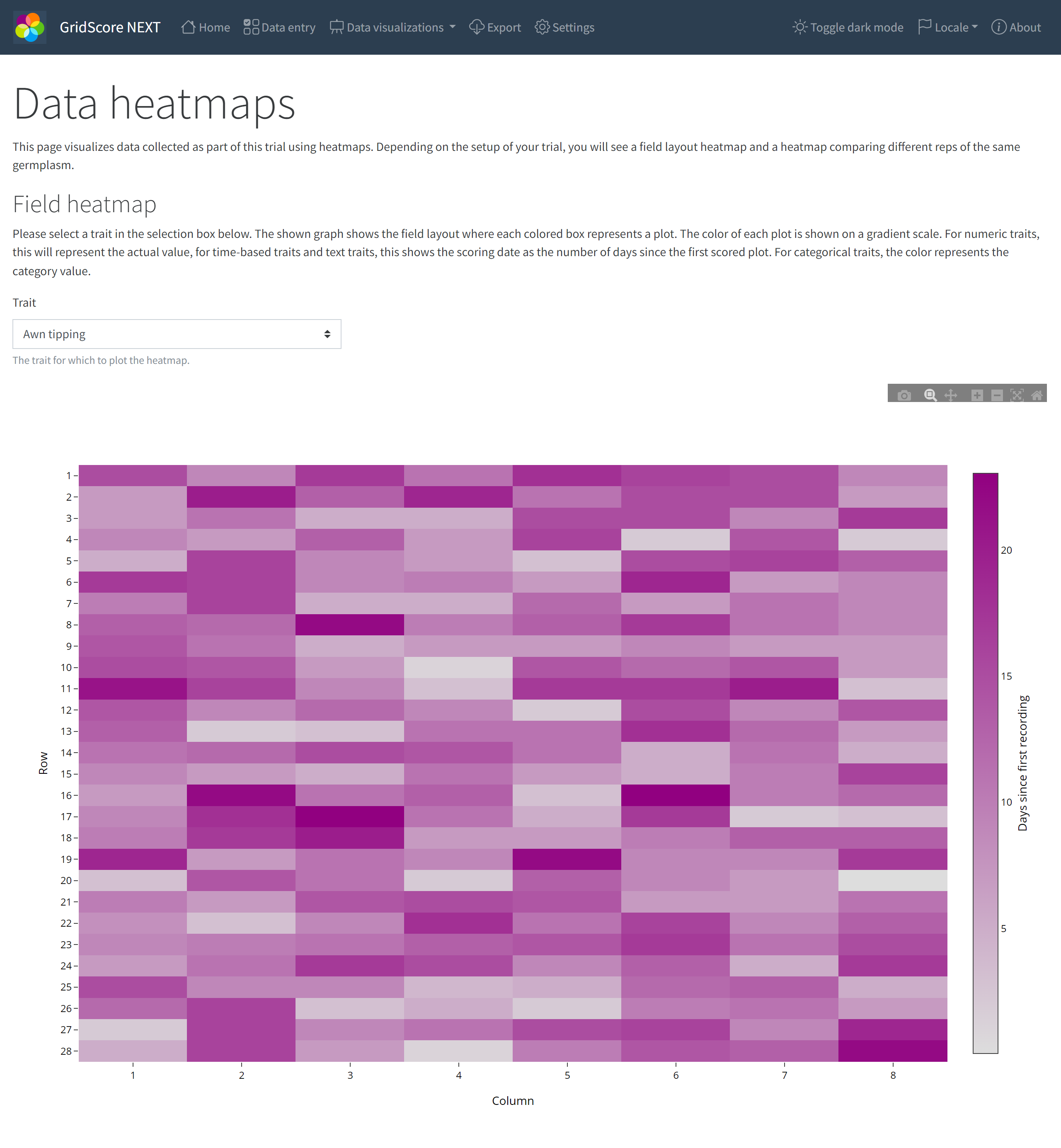
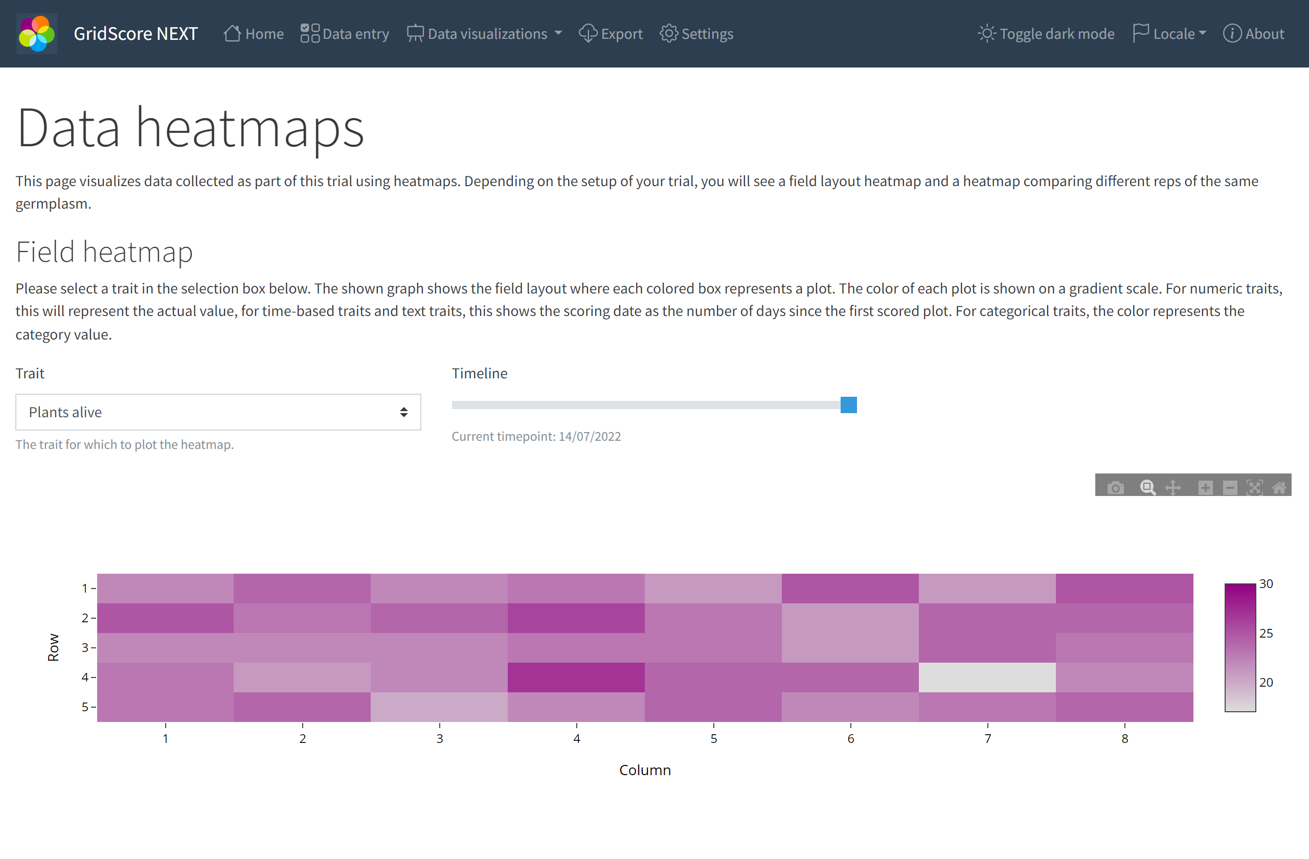
The field heatmap shows the distribution of values across your whole trial for a selected trait. We use a gradient for numeric and date traits that ranges from white to the color representing the trait. The darker the color, the higher the value for that trait. Time based traits are converted into “days since first recording”, simply because it puts the date values into perspective.
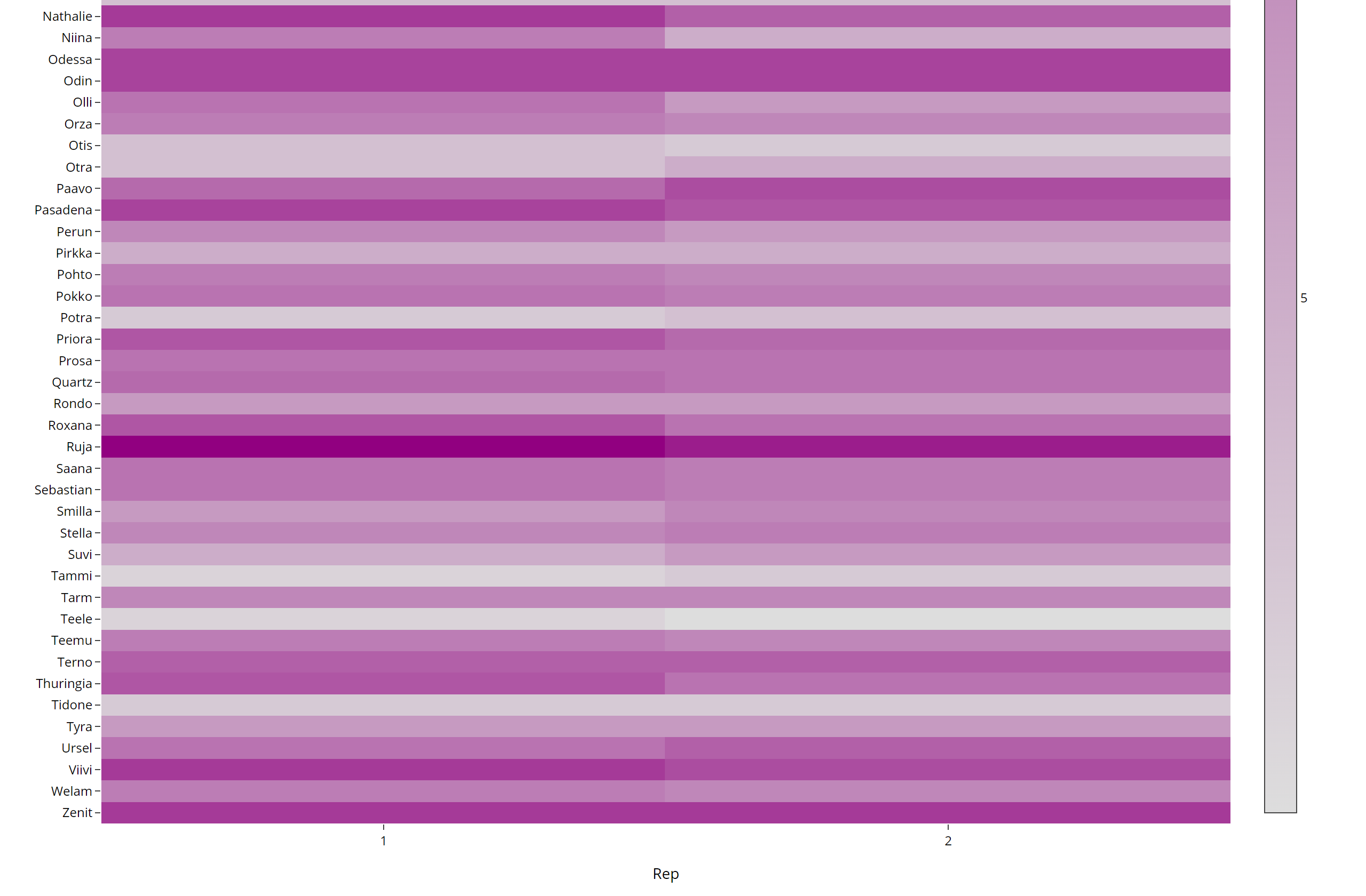
Similarly to the field heatmap, the rep heatmap uses the same color representation of values, but the arrangement of the heatmap is now based on the germplasm and the rep where germplasm runs along the side/y-axis and the reps along the bottom/x-axis. This plot is a good way of looking at the spread of data values across all reps of a germplasm. It can highlight potential errors in your data if, for example, the values were significantly
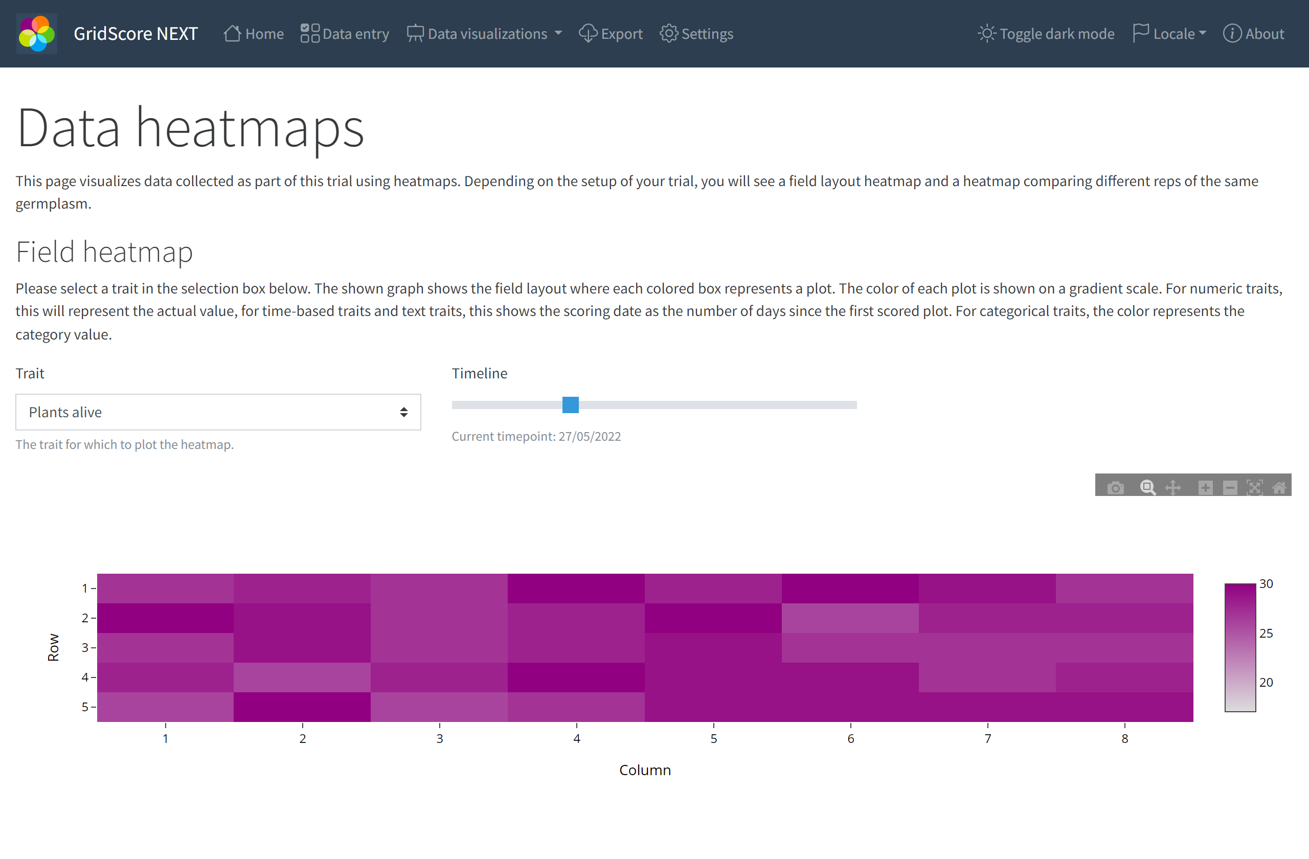
For traits that allow recording data across time, GridScore will show a time scale/slider that you can use to move through time. The heatmap will adjust and show the data for the selected date. The screenshot above shows an early time point while the one below shows a later time point.
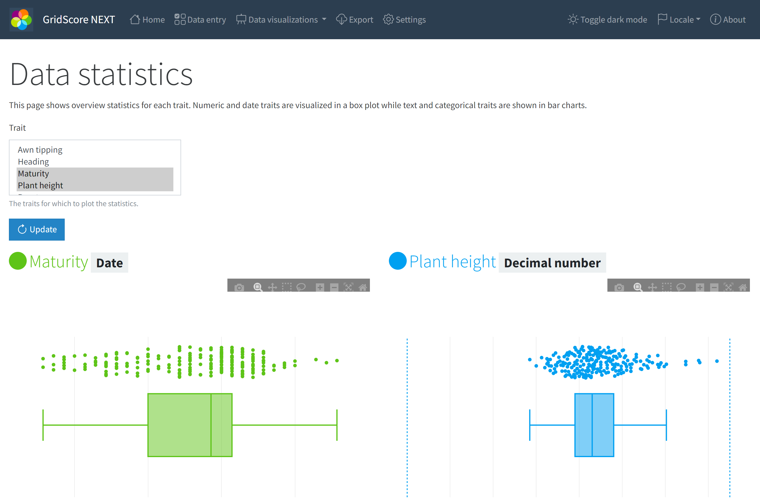
Trait statistics
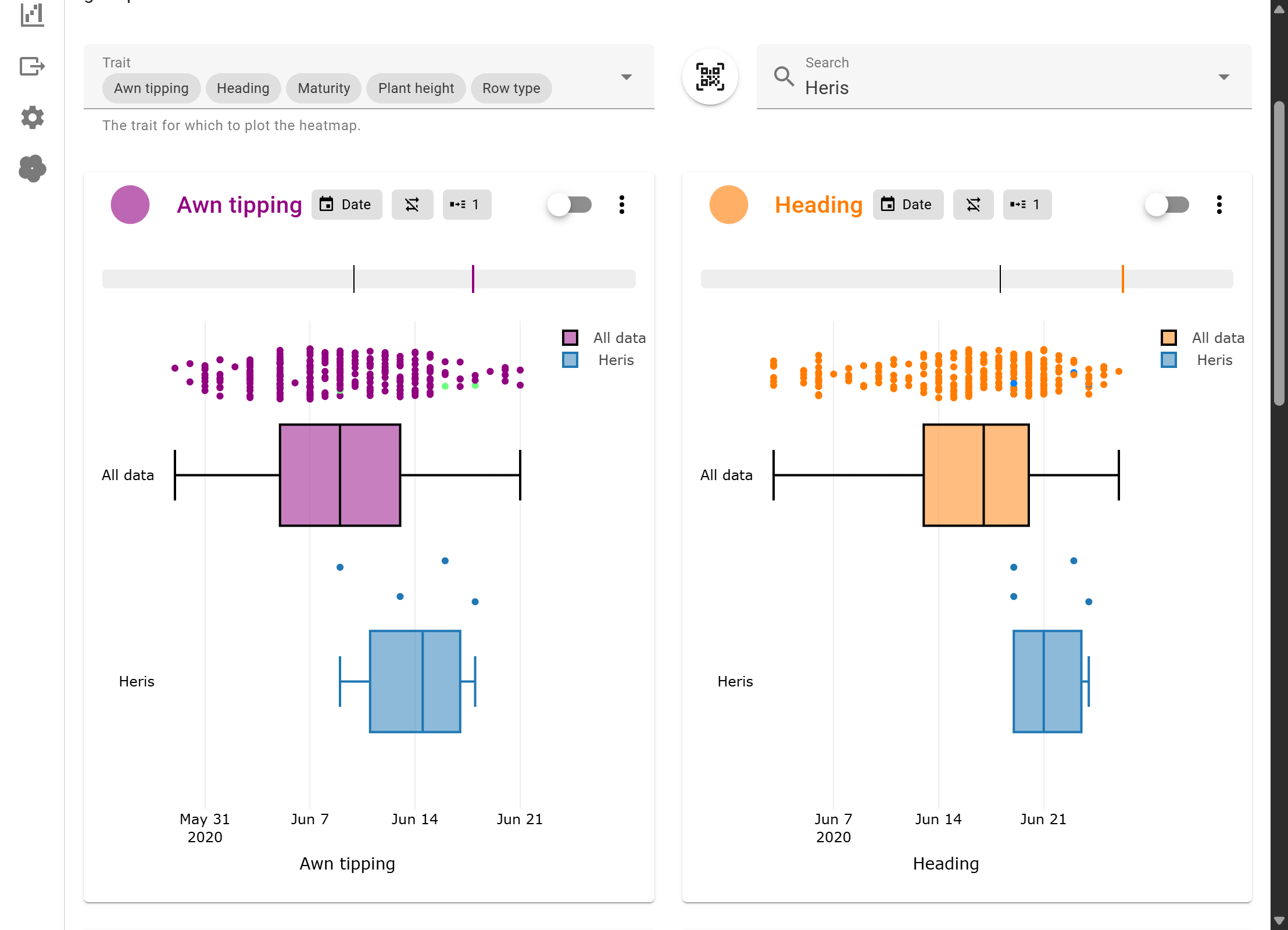
The next type of visualization that’s available are statistical plots like box plots and bar charts. These show the distribution of values for the selected traits and highlight potential outliers in your data. Sometimes these outliers are errors, but other times they may represent the most interesting data points in your trial. The example shows the distribution of values for the Plant height trait. There are 5 data points that are higher than the rest of the dataset and they represent the tallest plots in the whole trial. Depending on your trial you may be looking for those extremes and GridScore can easily highlight them for you.
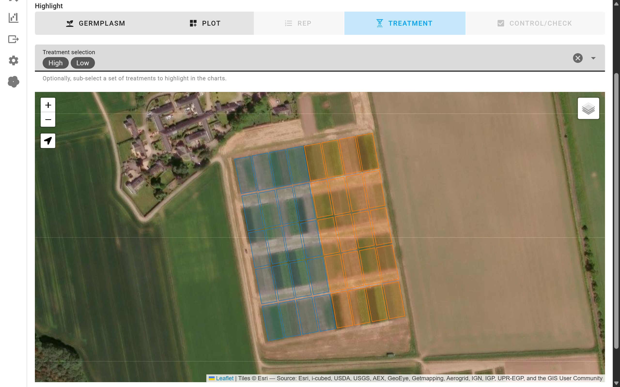
You can highlight certain groups of germplasm/plots against the whole data to compare their performance. Overall, there are the following highlight options:
Germplasm: Compare the overall performance of a germplasm (including all reps) against the rest of the data.Plot: Compare a specific plot (germplasm + rep combination) against the rest of the data.Rep: Highlight the performance of individual reps (all plots in that rep) against the remaining data.Treatment: Highlight the performance of individual treatments (all plots with that treatment) against the remaining data.Controls: Highlight the controls that were used in the trial against the remaining data.
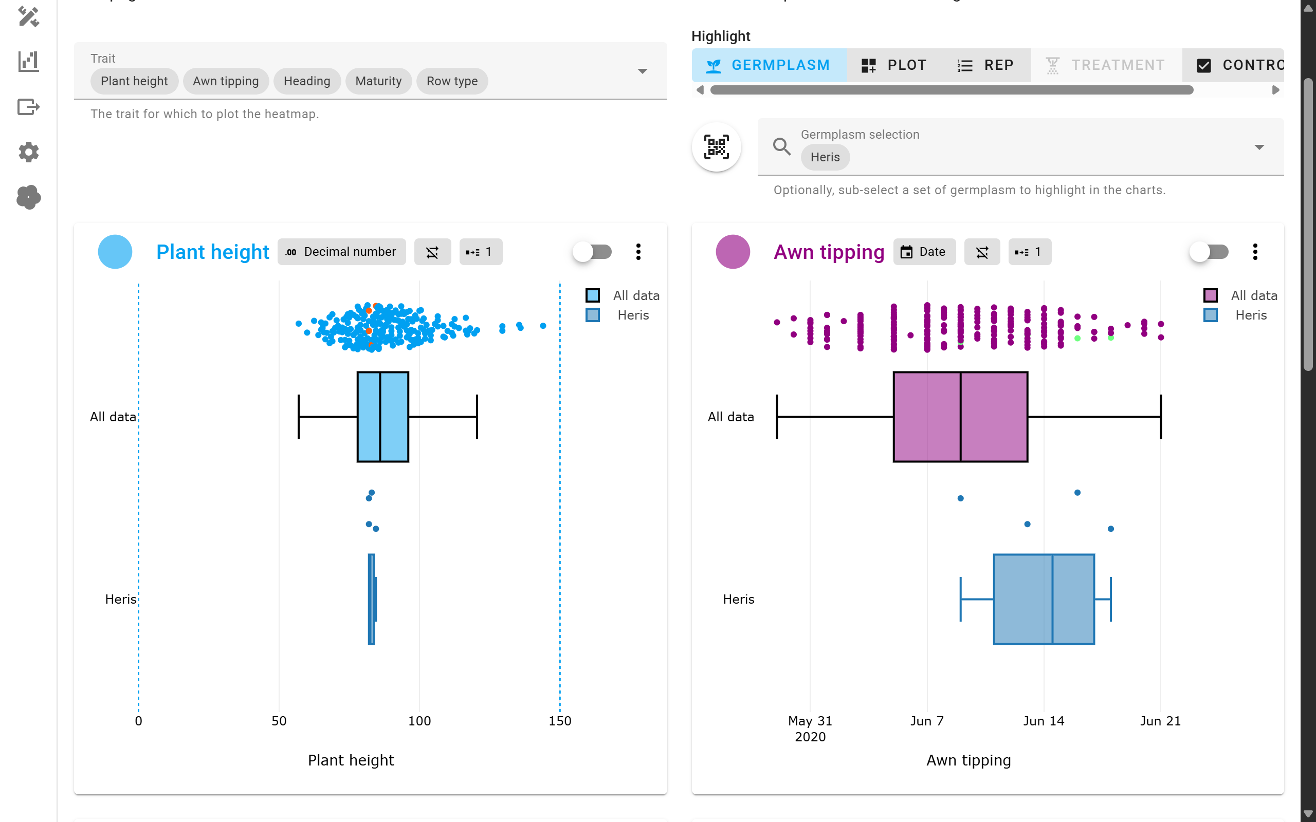
When highlighting germplasm, select the corresponding germplasm identifiers from the search box and GridScore will display individual box plots (or bars) for all data points for this germplasm across all reps.
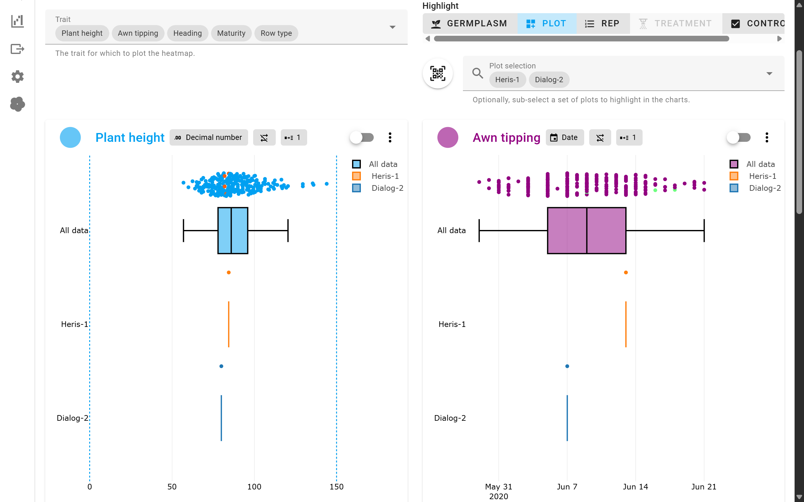
Similarly, you can highlight individual plots (germplasm + rep combinations) to see their performance.
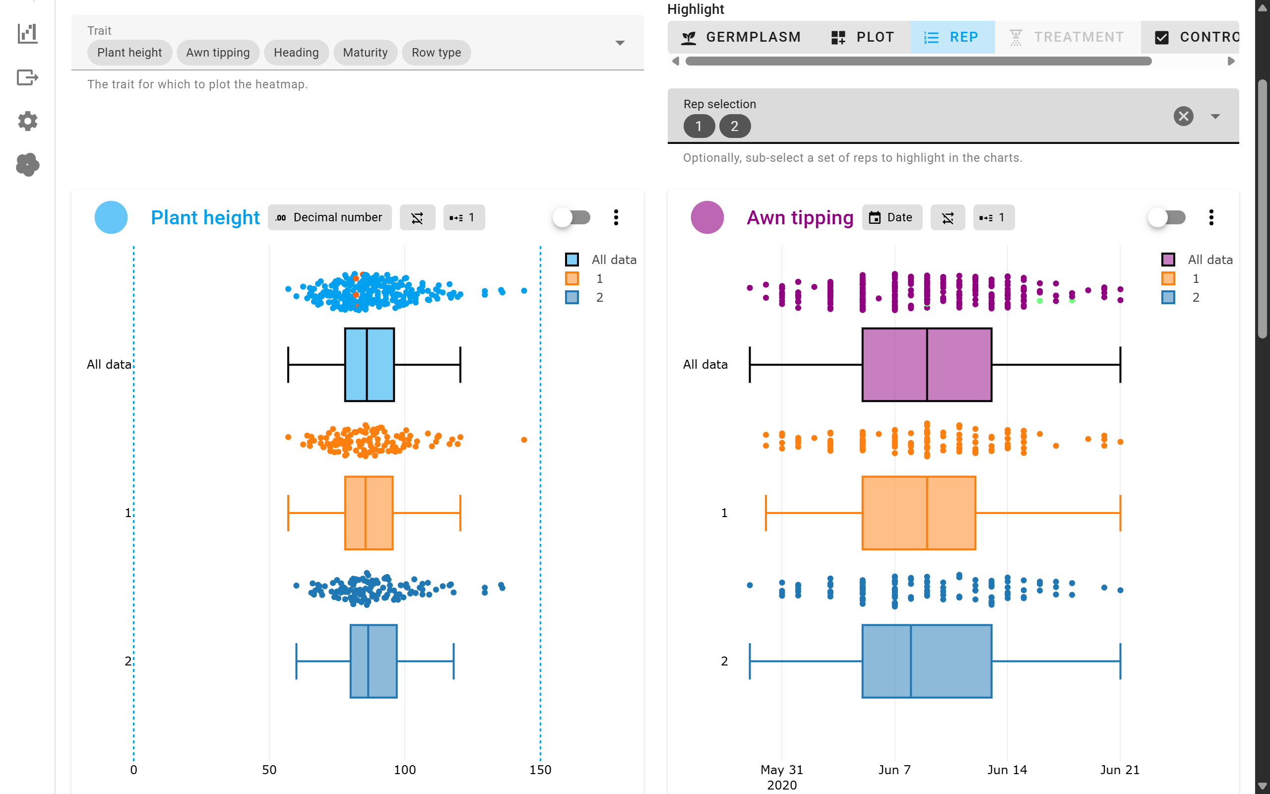
It’s also possible to compare individual reps against other reps or the overall trial.
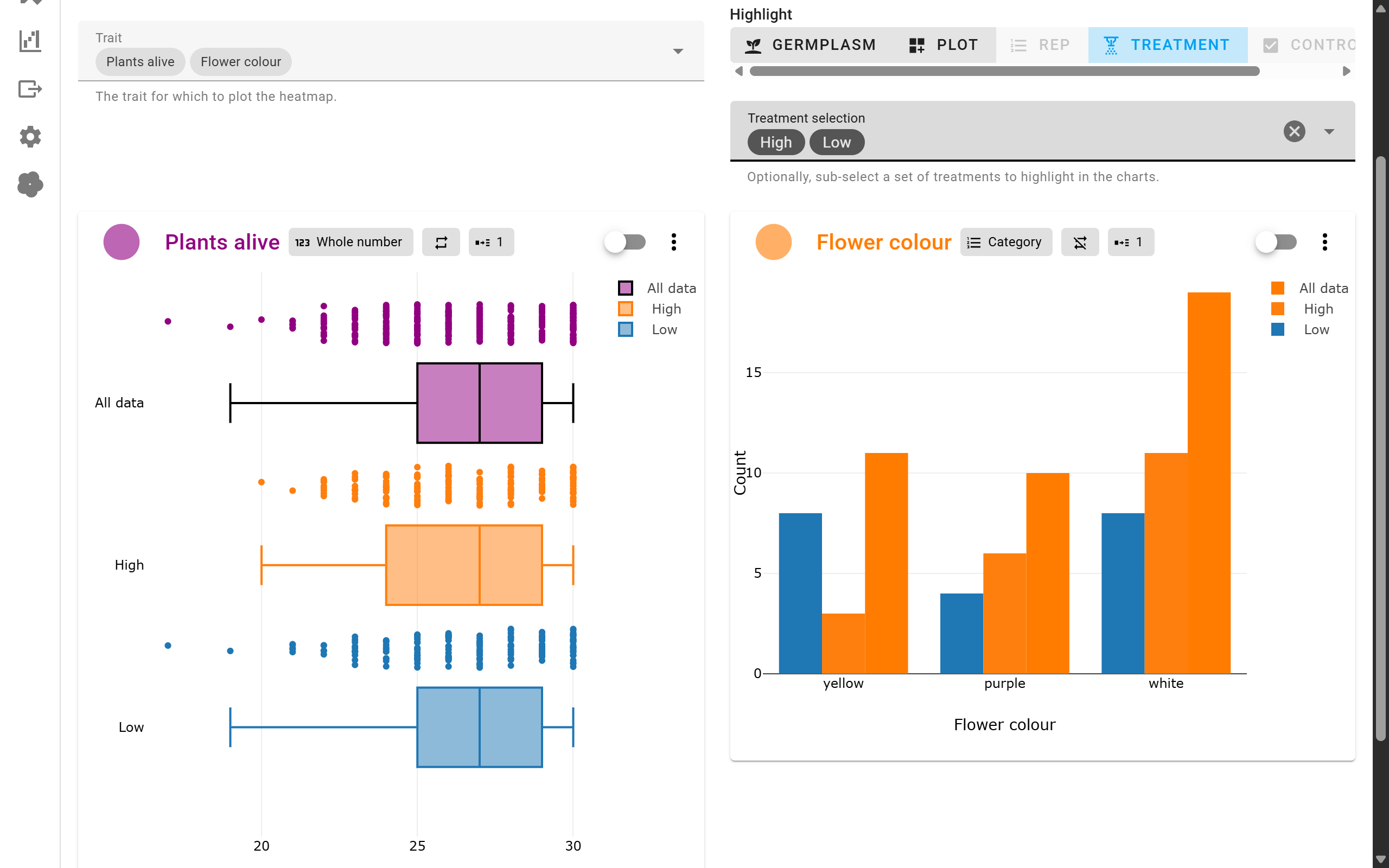
And in a similar fashion, this can be done for treatments as well.
Trial statistics
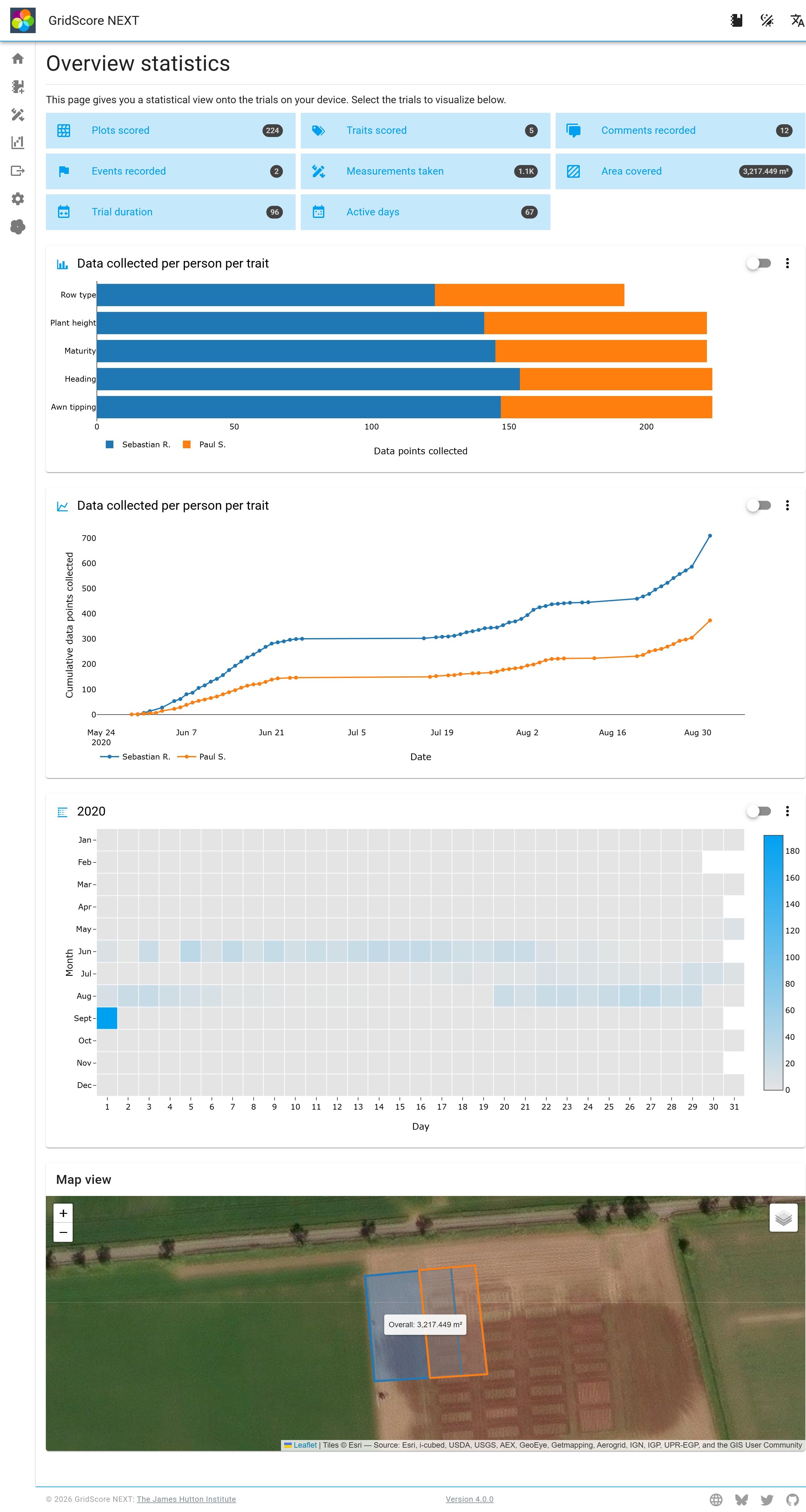
Most of the other visualizations provide information that’s fairly detailed and drills down to the individual data points. This page will provide a higher level view onto the trial. At the top of the page there is information about things like total number of data points collected, event and comment counts, active days and more.
If individuals have been defined, the number of data points scored is broken down by individual and shown in a variety of ways.
Below that, there is a heatmapped calendar view highlighting days when data has been recorded.
And finally, there is a map showing the area covered with data recording. This will only be available if GPS tracking has been enabled in the settings and GridScore has been granted the permission to use GPS information.
Timeline visualizations
It’s often useful to look at your data over time to look for changes or patterns that wouldn’t be obvious if you were just looking at a single point in time. For this purpose we have added a few timeline visualizations which we will highlight now.
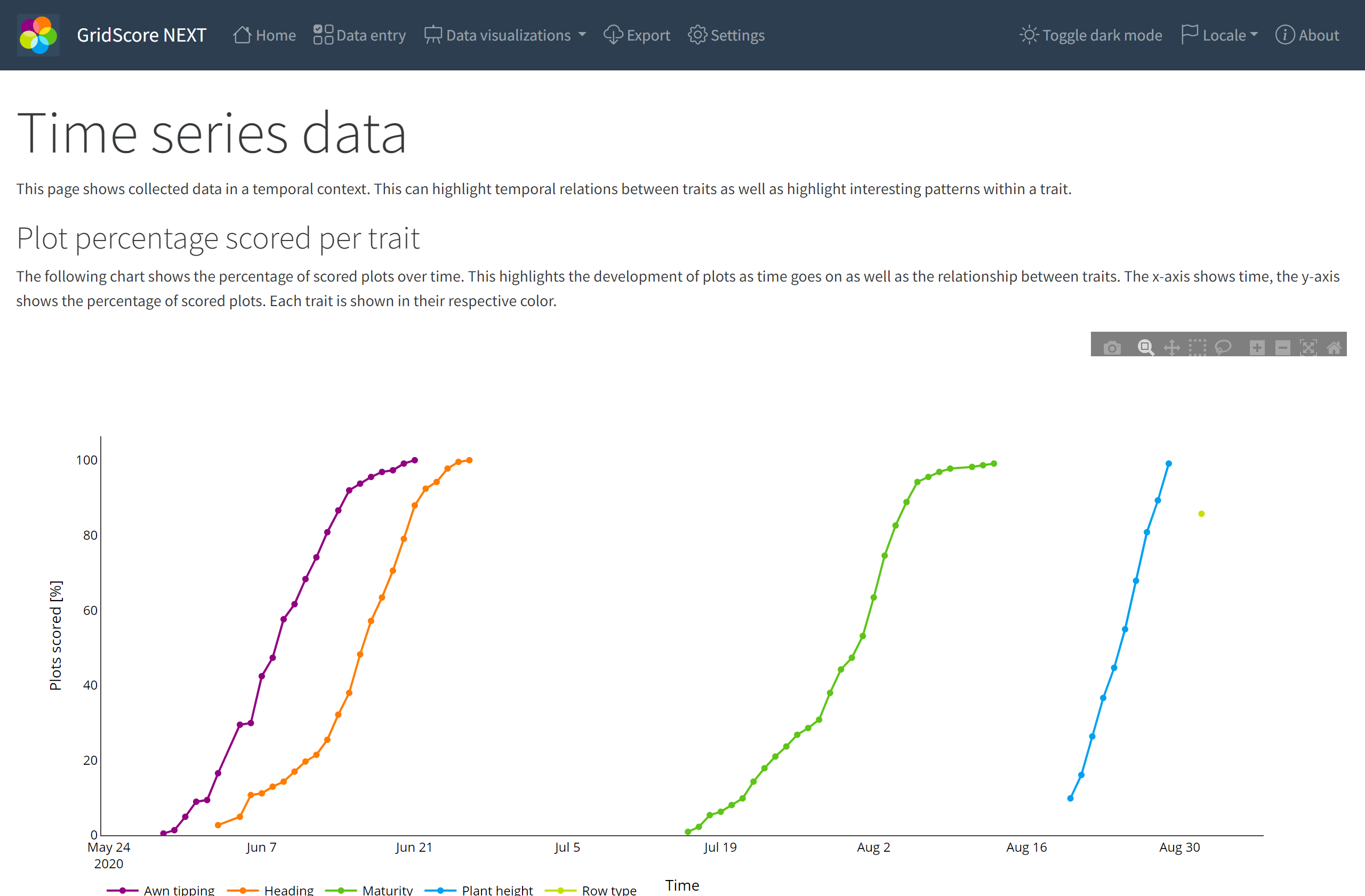
The plot percentage per trait chart shows you by what date how many of your plots you have already collected data for by trait. Looking at the first screenshot above, you can see that data collection started in late May, early June where Awn tipping was first scored. Over a period of three weeks, all plots have been scored for this trait. Overlapping that, the scoring of Heading has started which follows an almost identical shape and finishes around the end of June. Maturity again exhibits a similar shape, but takes place a good six weeks later than Heading. Finally, Plant height has been scored over a period of a little more than a week and Row type was scored on a single day, but not for all plots. It only reaches a completeness percentage of 85%.
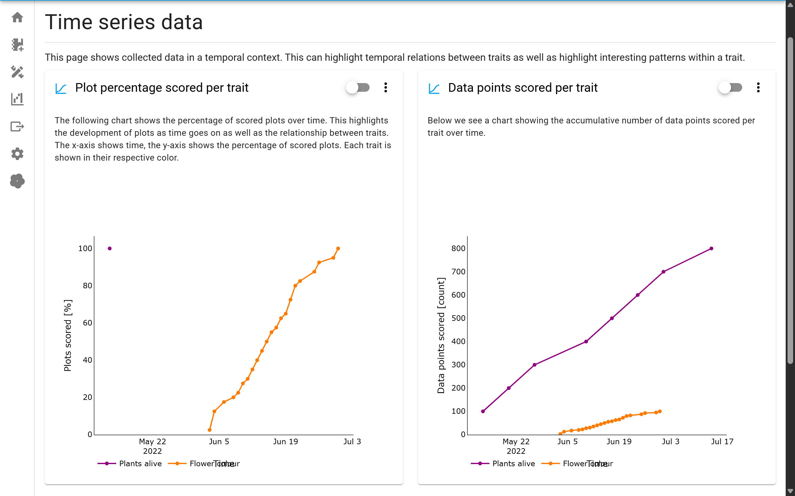
The second screenshot above shows a different trial. I this case, we have a trait that is scored multiple times throughout the season: Plants alive. This trait only shows up as a single point in the plot completion chart because all plots were scored on that date for the first time, hence the completion is 100%. Since we cannot know how often a multi-trait will be scored over the season, this is the best we can do when it comes to this visualization. The single-measurement trait (Flower colour) is only scored once per plot and not all on the same day, so you can see the progress over time.
When multi-traits are present, we show another plot in addition to the first one. The second plot shows number of data points recorded per trait over time. Now you can see the progress for the Plants alive trait since we’re looking at number of data points and not number of completed plots. The curve for single-measurement traits will be the same as in the first plot.
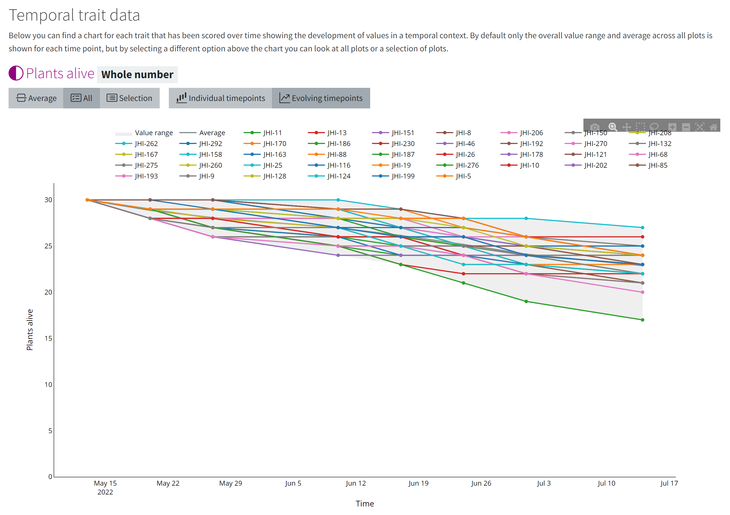
Similarly to the overall trial timeline, we can also look at the timeline of a single trait, assuming it’s a trait that allows multiple measurements over time. In this case, we’re looking at a trait that measures the number of plants that are still alive. At the beginning of the trial, all plots start with 30 individual plants. The grey area in the background of the plot represents the value range over time covering minimum to maximum for each time point. The dark grey line represents the average per time point.
We can now overlay data for specific germplasm, replicates or treatments to see their development over time. The first screenshots looks at the average performance per treatment over time. You can see that the high nitrogen treatment has consistently higher values over time staying above average the whole time. The low nitrogen treatment on the other hand performs much worse staying below average throughout the trial duration.
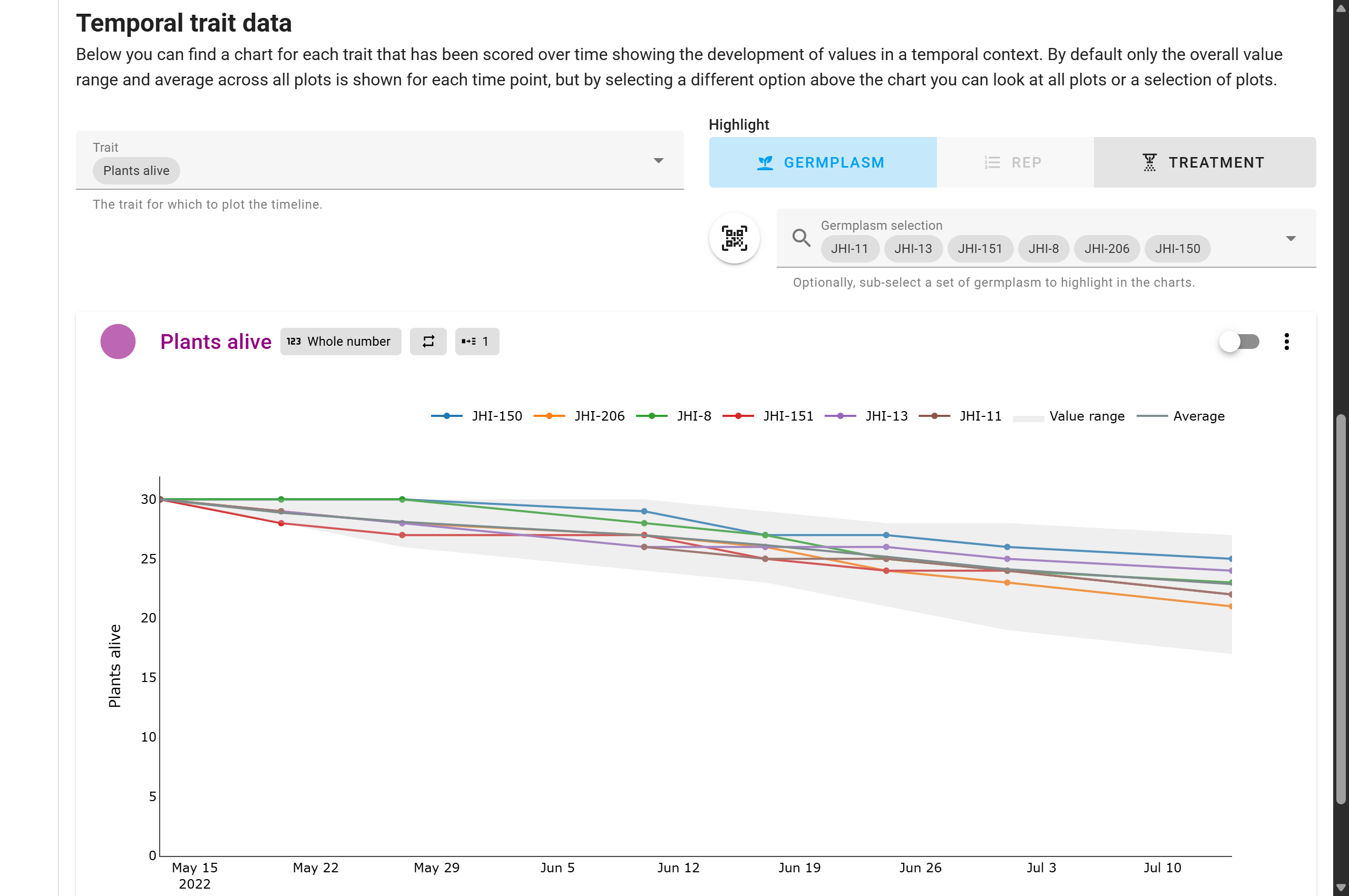
Similarly, we can also select and highlight individual plots/germplasm. Select the highlight option and search for the plots to highlight in the chart. In this case we have selected 6 different plots and you can see their performance over time.
Germplasm performance
This page is similar to the trait statistics page, but focusses mainly on the performance comparison of individually selected germplasm against the rest of the data.
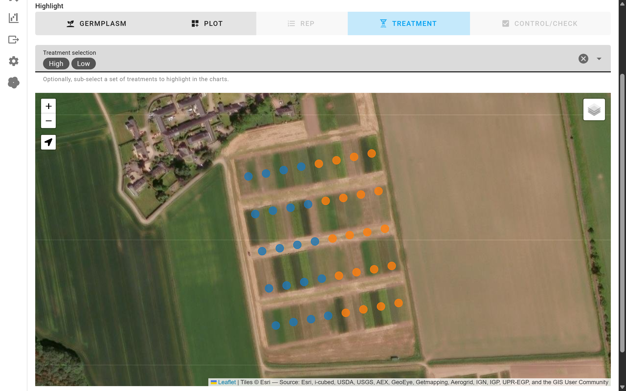
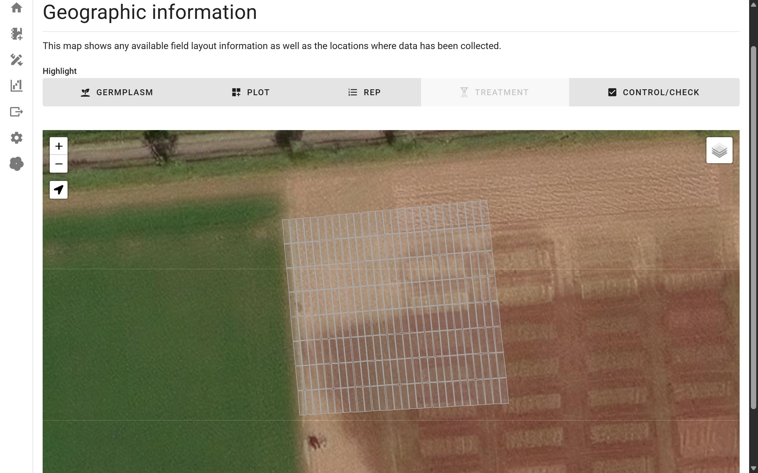
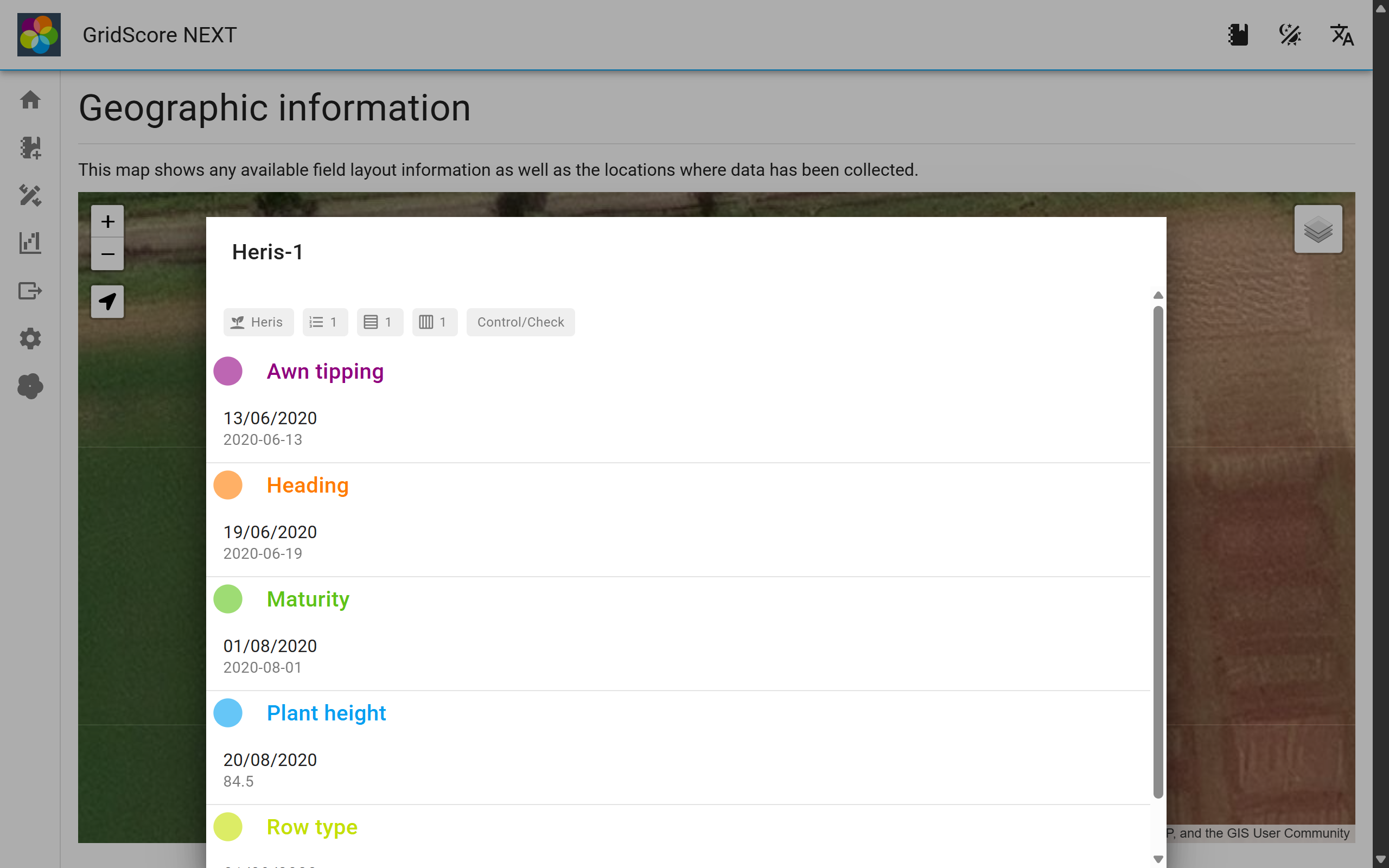
Map
The map visualization shows your data in a geographic context. If corner points have been defined, the trial layout will be shown on the map, otherwise individual GPS coordinates will be shown. Selecting a plot or a map marker shows data recorded at this location.
You can use the control above the map to highlight specific types of plots including: Germplasm, Plots, Reps, Treatments and Controls.
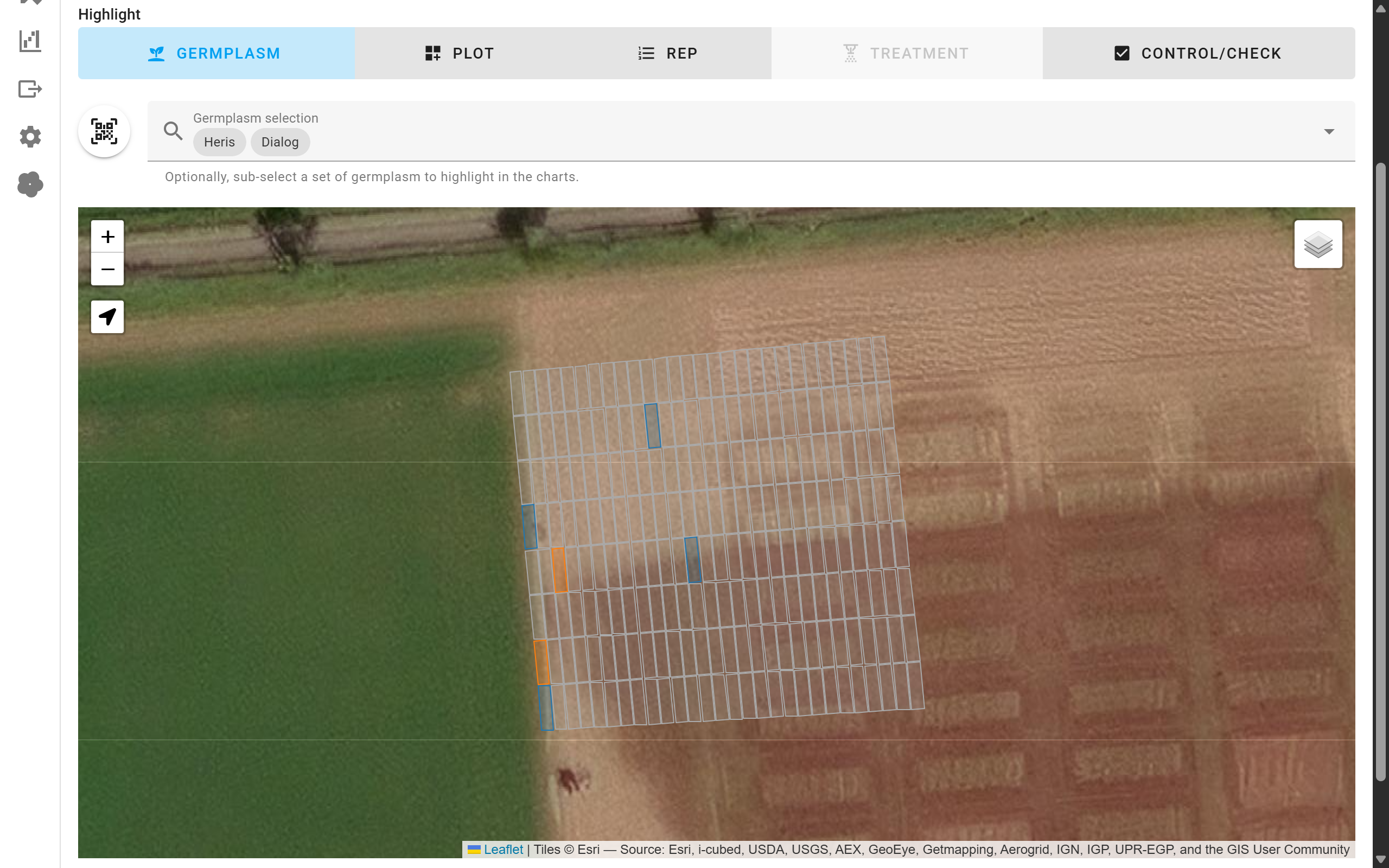
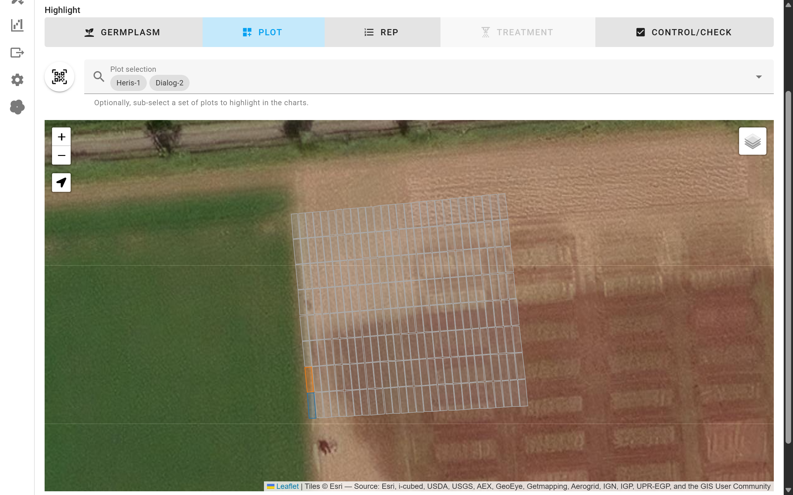
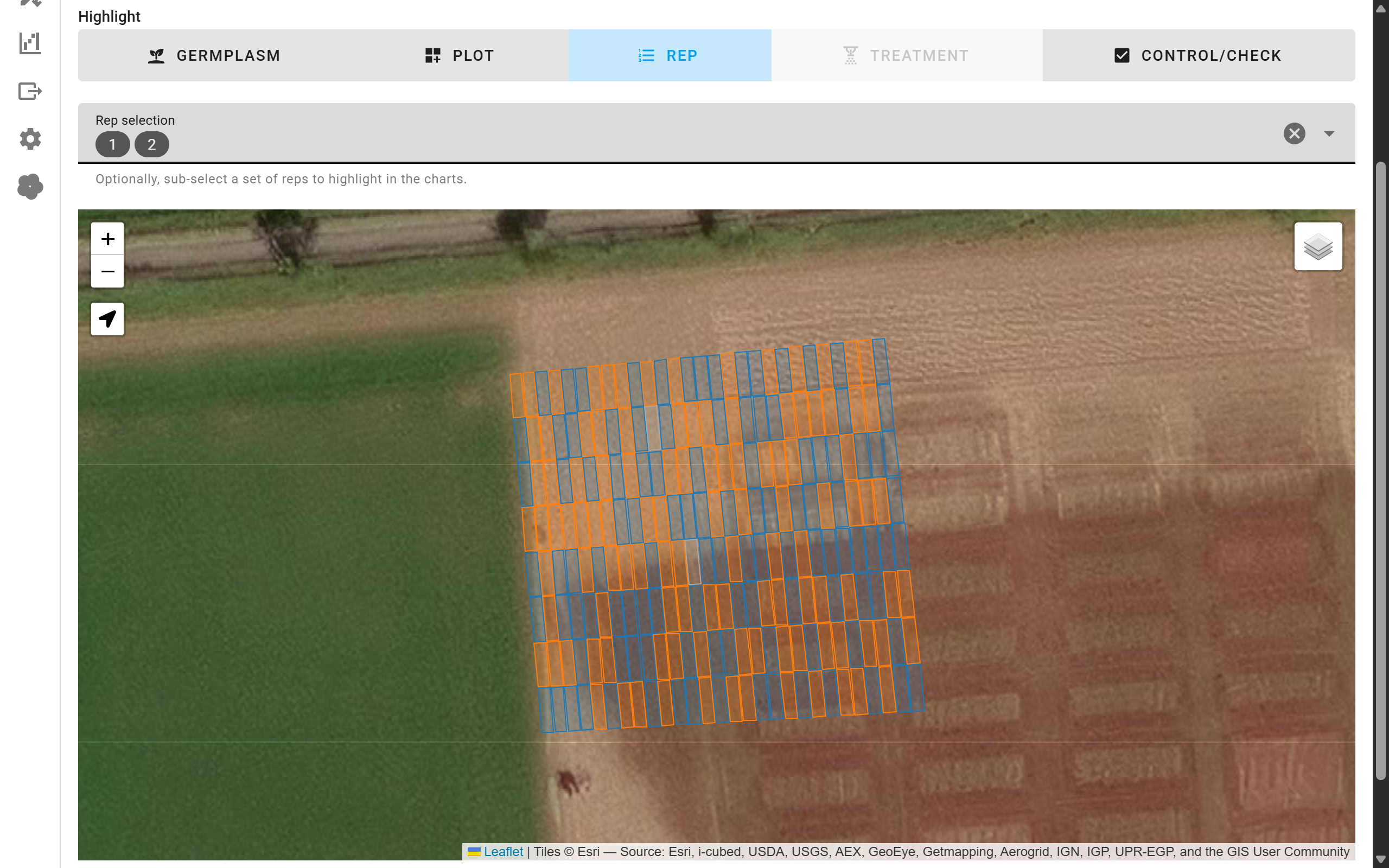
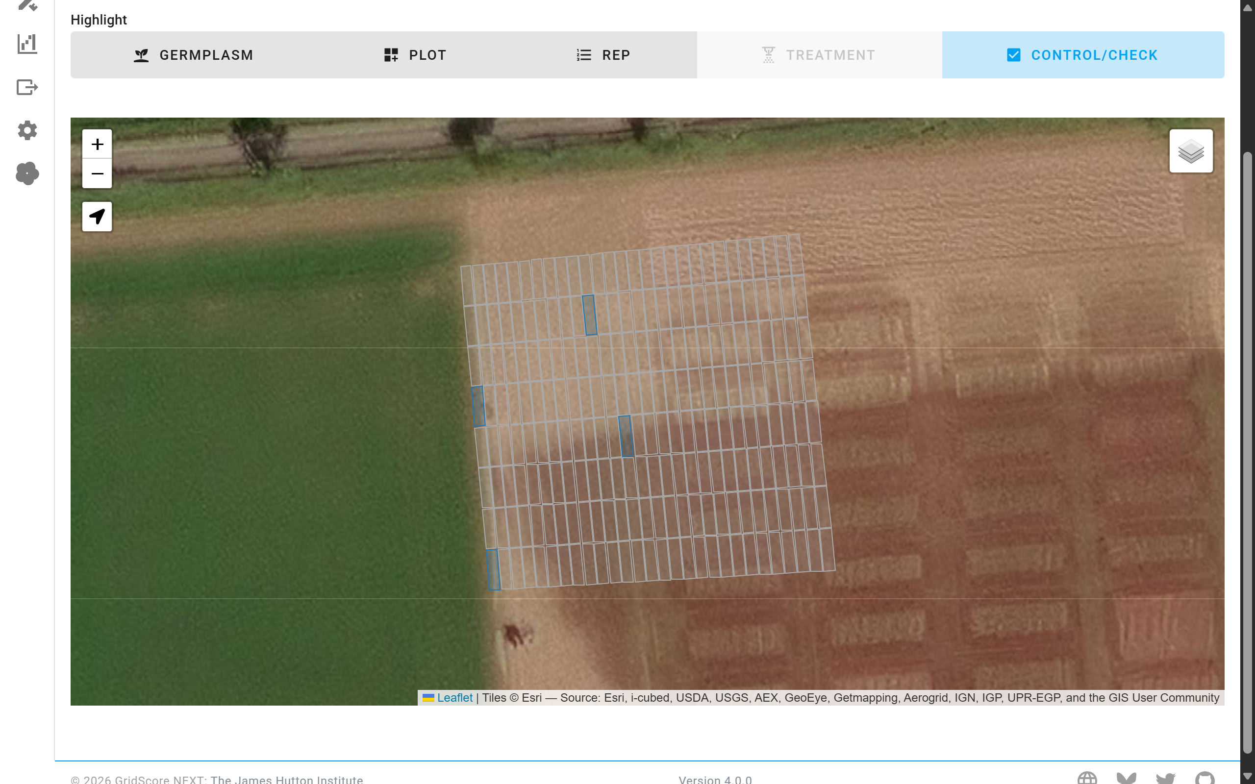
If no corner points have been defined for a trial, the center point of each plot will be shown as a circle instead. The highlighting still works in this case.